The Psychology of Web Design: Unlocking Human Behavior to Drive Conversions
- September 26, 2025
- Web Design, Web Development
This guide explains the core principles of web design psychology from color to layout, from trust-building brand cues to CTA placement so you can align user behavior with business goals.
The Power of Color: Trigger Emotion and Signal Trust
Color is the first thing a visitor’s eye notices, and it prompts an instant emotional response. Color choices influence how visitors feel and what they do the moment they land on your page. They communicate your brand’s promise and prime users to act.

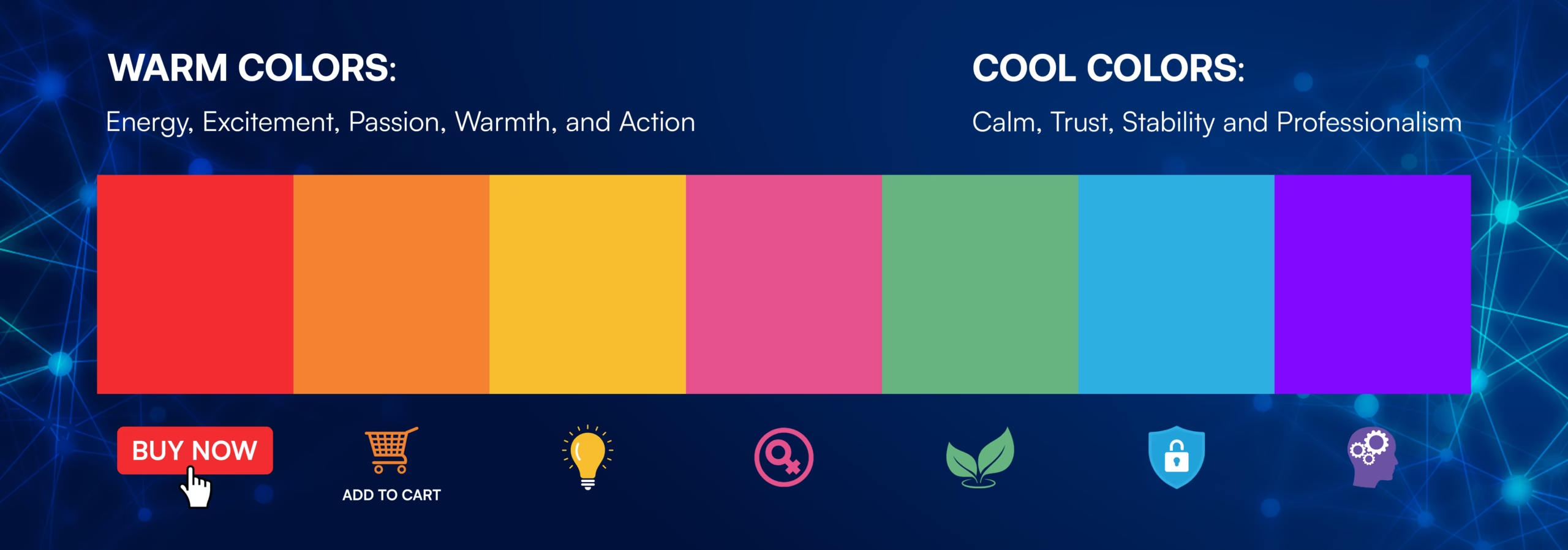
Warm colors (red, orange, yellow) are high-energy and activating. Red grabs attention and can boost clicks on primary CTAs like “Buy Now.” Orange famously used for Amazon’s “Add to Cart” radiates excitement without overpowering. Yellow highlights important elements and evokes warmth and optimism.
Cool colors (blue, green, purple) embody calm and professionalism. Blue, favored in finance and healthcare, conveys stability and trust. Green suggests wellbeing and growth ideal for sustainability or wellness brands. Purple connotes creativity and sophistication, appealing to premium or artistic markets.
Graphics & Design is where you can master the art of color to create a brand that connects with your audience.
Layout That Leads the Eye and Reduces Friction
A website’s layout does more than hold content it predicts behavior and reduces cognitive load. Design for the scanning patterns people naturally use, then place key content along those paths
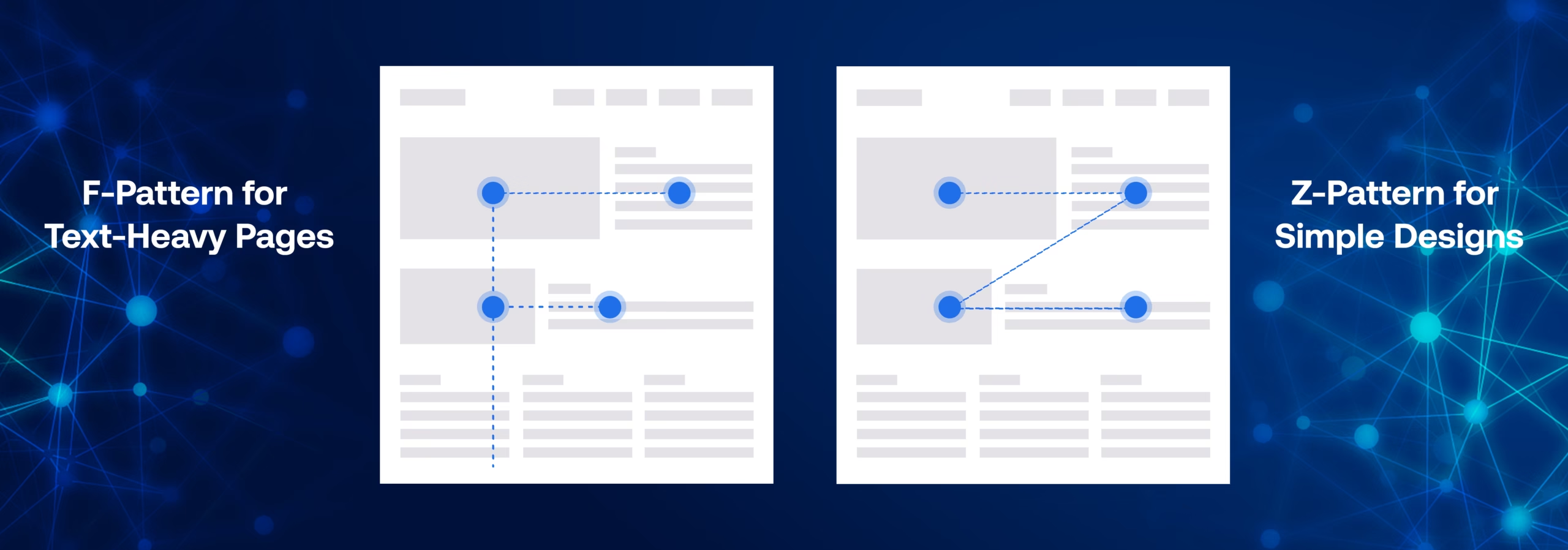
F-pattern (text-heavy pages): Users scan across the top line, then down the left side, making shorter horizontal scans as they move. Put headlines, subheads, and key links along this path.
Z-pattern (sparser pages/landing screens): Eyes travel left-to-right across the top, diagonally to the opposite corner, then again left-to-right along the bottom. Anchor logo/USP at the top-left, primary CTA at the top-right or bottom right.

Whitespace (negative space) improves readability and focus. Like Apple’s minimalist aesthetic, strategic whitespace reduces clutter and spotlights what matters.
CTA placement matters: place primary CTAs above the fold, repeat after benefits/objections, and ensure high contrast and clear hierarchy.
Branding Decisions That Create Indomitable Trust
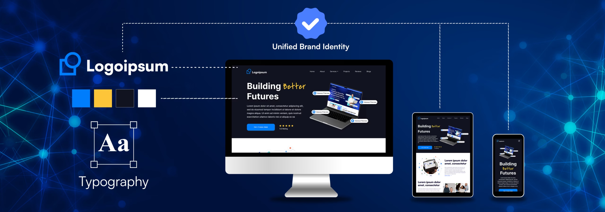
Brand trust isn’t just a logo it’s the consistent system of colors, type, tone, and imagery that creates familiarity.
Consistency across touchpoints: Keep logo usage, colors, typography, and microcopy aligned across pages, emails, and ads.

Authenticity over perfection: Use real staff photos, founder notes, and genuine customer testimonials. Human-first imagery (a key to Airbnb’s early traction) improves credibility
Social proof: Prominently place ratings, reviews, case studies, press logos, and trust badges near CTAs.
This is all part of a robust Website Design and Website Development strategy that we help our clients with.
Design Is Influence
Effective websites aren’t just pretty they are psychologically crafted to guide users from first impression to final conversion. Every design choice nudges behavior. Mastering these principles transforms your site from an online brochure into a reliable growth engine.
This powerful combination of design and strategy is what truly drives conversions, and a key part of that is a fast, seamless user experience. To ensure your site is performing at its best, consider our Website Speed Optimization services.
Ready to build a trustworthy website that increases conversions? Let’s talk about how our Search Engine Optimization and Video Editing can further enhance your digital presence.
FAQs : Web Design Psychology & Conversions
By using colors, layout patterns, and visual triggers that establish trust, reduce friction, and highlight value, website design guides users from passive browsing to confident purchasing.
Relevant color choices, consistent branding, authentic imagery, visible social proof, and clear policies all contribute to building trust. These are all part of a comprehensive approach to Graphics & Design.
A CTA is the next-step prompt (e.g., “Buy Now,” “Get Started”). Placement along natural scan paths and moments of high intent increases click-through and conversions. This is a vital part of Website Development.
They map how people scan pages. Placing headlines, benefits, and CTAs along these paths makes them more likely to be noticed and acted on, improving the effectiveness of your Search Engine Optimization.
There’s no universal winner. Choose a high-contrast color against your background and keep it consistent for primaries. Test red, orange, or your brand accent to see what resonates with your audience.
Yes, users still scan. On mobile, prioritize vertical rhythm, concise headlines, sticky CTAs, and generous spacing to support quick decisions. This is also key for Website Speed Optimization to ensure your site loads fast and looks great on any device.
